Posted at 2013-03-07 18:32:38 — Link
Please try to avoid the following mistakes to be sure that your skin will be approved. We're getting a lot of skins that can't be approved only because of the image quality flaws.
You may find several old public skins that do not comply with some of these rules. These skins were submitted and approved on the beta phase when we were working on the rules according to the skin submissions that we got then. We won't remove the skins that are already approved but please follow these quality requirements for your future submissions.
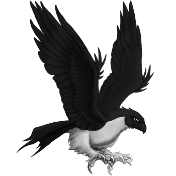
1. Image has big pitch-black/filled with uniform color areas. All the pet details should be clearly visible. Don't use opaque and too dark colors.
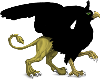
To make sure that your monitor contrast is calibrated correctly, please use these 2 links (all of the squares should be distinguishable from the background if the monitor is calibrated correctly):
http://www.lagom.nl/lcd-test/black.php
http://www.lagom.nl/lcd-test/white.php
The fact that everything is visible on you monitor won't help the players who do not have too high contrast or brightness.
It's a good idea to find a decent photo of a real animal with coloring similar to your design in order to understand how the lighting and forms change the colors, and use it as a coloring guide. For example, check this raven from Wikipedia. The main color of the bird on this photo is gray which turns black only in the deep shadows.
If you still want to use very dark color as a base then you will have to put some additional efforts to create some additional highlights and gloss in order to make your artwork not flat. For example, here's a black horse from Wikipedia with great glossy pattern created by the light reflecting from the pure black fur.
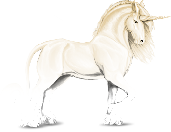
2. The same is true for overexposed (too light) images.
It's a bad idea to fill the base with light color and put it to 100% opacity overlay.
3. Heavily pixelated lineart. See these jaggies all around the image border? They are really not nice. Use any kind of smoothing or anti-aliasing (but not blurring!) and always be sure to save your image with multichannel transparency (always use PNG 24-bit; 8-bit has only one transparency channel).
![]()
This also concerns all design elemetns that you draw. Make sure that your artwork doesn't look like it came from MS Paint. Anti-aliasing is mandatory to make the it look clean and consistent. The only exception is a full image using pixel art style.
![]()
4. Color inversion. We highly recommend studying references for for translucency and glow effects instead of just hitting "Ctrl+I". The shadows and lights will create a different pattern for a luminescent or transparent object than this.
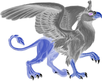
5. Repeating of existing official or custom skin designs; altering the existing official or custom skins which were not created by you.
List of official skins
List of custom skins (filtered by your active pet species)
6. Background that is not transparent.
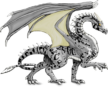
7. Image problems that are visible only on a dark background. Always check your skin on different types of backgrounds.You may see transparency problems, stray lines and strokes and coloration flaws that are hard to notice on the white background.
This is the same image on different backgrounds.
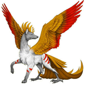

8. Redundant use of effects and filters.
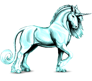
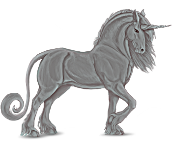
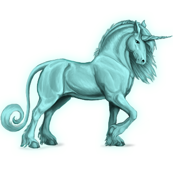
9. Usage of third-party brushes, patterns, textures and cliparts
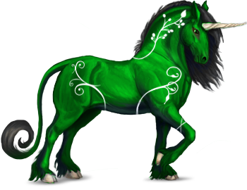
This skin uses a premade floral brush that may be unauthorized for use in the third-party products.
10. The skin portraying a wrong species.
There is a number of characteristics that makes a species recognizable. A multi-headed wingless reptilian creature isn't a dragon but a hydra. A canine with wings and 4 canine paws isn't a symurgh but a winged wolf / dog. Please make sure that the species is clearly recognizable. Keep the number and the type of limbs and other body parts the same with the official artworks of a species.
11. Avoid using soft brushes when adding patterns unless you know what you're doing.
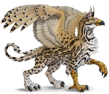
Make your patterns crisp and detailed. Soft brushes are good for smooth color blending between different body parts, but they don't work for patterning most of the time. There's a notable difference in quality between these two skins:
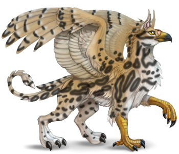
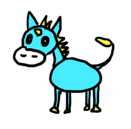
12. Art quality: poor or too simplistic art / design.
We do not approve just any skin which follows all the rules above. A skin should have at least minimal artistic value. Probably you know that drawing a stylized animal sometimes is more complicated than drawing a realistic one: you need to deal with anatomy, shading, perspective AND the rules of stylization.
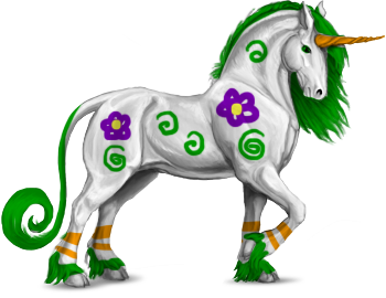
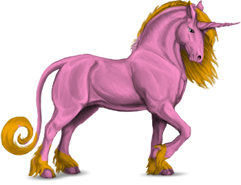
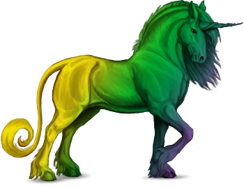
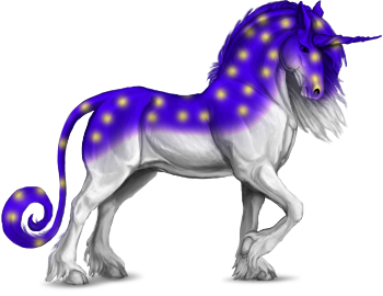
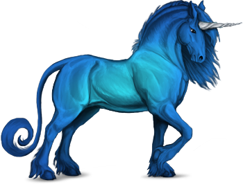
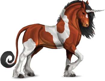
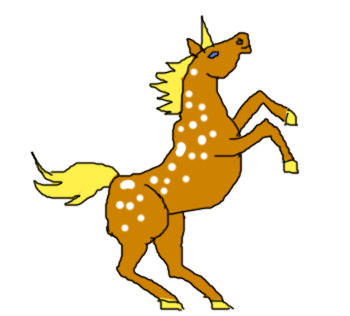
The same concerns the coloring of official bases: just filling the base with 1 or 2 flat colors, adding some untidy patterns or applying a gradient are not enough for a good skin. Please respect the players who are going to use your art. It doesn't mean that you need to use 10 different colors and super-complex patterns to pass the moderation. Just try to make your skin look nice and honor coloring, lighting and texturing rules as well as the anatomy. Make sure that every design element is on its place and the whole artwork is consistent and tidy.
Sorry, none of these skins will be approved. Each of them took us one minute to create, and they demonstrate obvious lack of quality.
Things that will be a big plus and increase the chances of approval:
- accurate and detailed patterning and texturing
- good work with ligthing and coloring
- utilizing a consistent concept and style all over the skin
- creating your own quality bases


