MInd if I give you some tips?
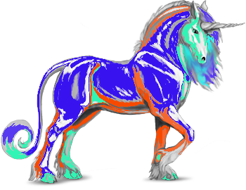
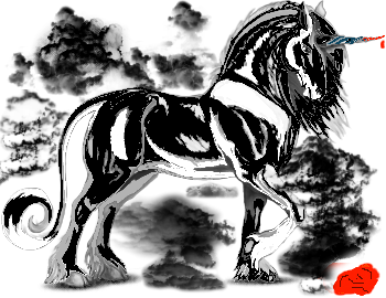
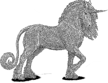
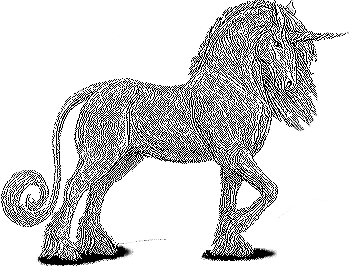
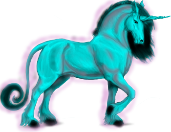
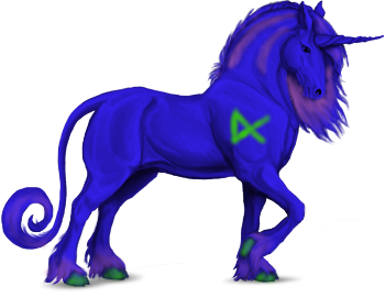
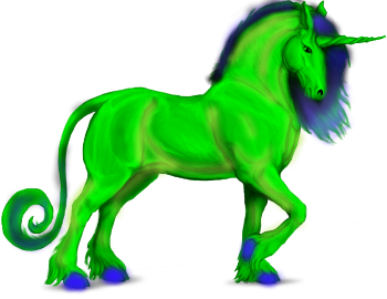
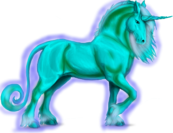
I think the first few got rejected because they're of low quality. Not the idea or concept, but the image itself. They're pixelated and a bit glaring. I don't mean to sound harsh, but I really do want you to pick back up where you left off because the last ones look significantly better. Angel's issue with the last ones were probably how they were cropped. The best example is the last one where the highlights around the unicorn were cut off/ outside of the picture. I believe what you'ev shown is significant improvement, even if it doesnt feel like it now.
I think one way to take your skins to the next level is with a palette generator. I've never used gimp, but I imagine there's a way to type in a color code and get the color you want so my suggestion is to look at palette generators like these that I've linked bellow.
http://paletton.com/#uid=1000u0kllllaFw0g0qFqFg0w0aF
http://app.coolors.co/51a3a3-75485e-cb904d-dfcc74-c3e991
Art and skins will always be kinda hard and I understand its always extremely discouraging seeing folks having their skins accepted and their art looks better. But use their art as a goal. Make it your goal to get there.
I say for now stick with just experimenting with color theory, then move onto other ideas.

