Posted at 2013-08-15 15:29:22 — Link
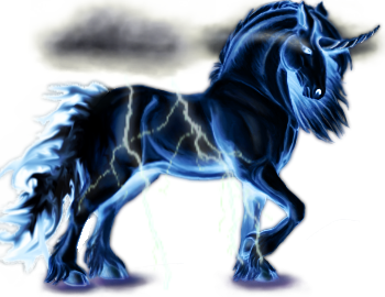
This is my first skin for this site and I think there might be a few problems with it (?).

Name: Calamity Descends
First off, any opinions on how it looks, regardless of whether it gets accepted or not? I think it didn't turn out that bad, except the clouds. I don't have a clue how to do clouds. Please help if you have an advice :)
But are clouds like that even acceptable? I didn't find anything regarding restrictions on surroundings, and the clouds and lightning are sort of part of her. She is supposed to represent the storm or rather a storm harbinger, and it's quite difficult to convey that without having a bit of surrounding with her. However I can still remove them if they're really that hopelessly ugly or completely unacceptable.
The second thing is, that I used colour inversion at the very beginning. I found the effect of it so very fitting for the theme and didn't realise there was a ban on that until I was practically half finnished. But I edited shading, highlights and a few other things completely, it really doesn't look much like the plainly inverted image anymore.
Comments, opinions and help are much appreciated!


