Posted at 2017-05-10 20:06:11 — Link

Leave feedback please!
![]()
Posted at 2017-05-10 20:31:55 — Link
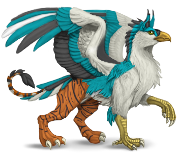
Ooh, that's cute, I like the colour combination!
Whoever calls on the name of the Lord shall be saved.
Random acts of senseless kindness.
![]()
Posted at 2017-05-10 20:55:56 — Link
Refreshing and different to any existing colourations. :)
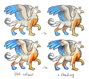
I would recommend adding some more contrast within the colours. Currently each area is obviously filled with one solid colour and looks a bit flat, even with shading overlaid on top. This is not your fault - a lot of skins have the same issue. Relying only on the base's shading and highlights to give a bit of depth.
You can enhance it by varying a colour, having brighter/paler and darker patches (usually following similar areas as the proper shading and highlights). Here's a quick sketch.

Of course your colours don't have to be really bright and shiny like that example, but maybe it helps to show the differences that varied colours can make.
![]()


Posted at 2017-05-10 21:21:26 — Link
This is more of a personal preference, but what about grey or black talons? The white sort of blend into the background of the site.
Also, I'd love to see a striking color for the eye to make it "pop" more.
Overall I like it though :) Looks good!
Always looking for Expand Stable Scrolls
| Chan eil aon chànan gu leòr |
![]()
Posted at 2017-05-11 05:38:03 — Link
Thank you arete
I love your little drawings Marans. As much as I'd love to try to shade, I'm really bad at in in real life and on digital drawings </3
Nightingale, I did try black talons, but I couldn't get the right shade of black or grey. I totally agree I could have gone more vibrant though, if I can get photoshop on my normal computer, I sure as heck will play around with flashier color c:
![]()
Posted at 2017-05-11 10:04:57 — Link
You can get the older photoshop that runs on XP for free on the net if I recall correctly. I have it somewhere, I just have no idea how to use it.
Whoever calls on the name of the Lord shall be saved.
Random acts of senseless kindness.
![]()
Posted at 2017-05-11 16:59:21 — Link
If you can't get Photoshop, try GIMP, Krita or FireAlpaca. They're all free, and I've used FireAlpaca for drawing for a few years. It's really fast, lightweight and has never crashed once. :)
Anyway, despite a little bit of flatness, I still like your skin design. Hope you'll try some more soon.
![]()
Posted at 2017-05-11 17:03:51 — Link
I have gimp, but I have huge issues with trying to get a transparent background.... I did it once yesterday, and then I couldn't replicate what I did (i had to trash it though because we can't use deviant skins as lineart). The skin was accepted though!
![]()
Posted at 2017-05-27 16:23:52 — Link
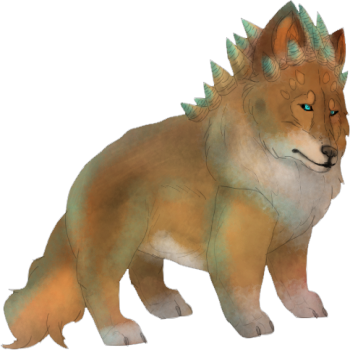
 I know the lines are a little light. Besides that, any suggestions?
![]()
Posted at 2017-05-27 17:33:02 — Link
Moracalle, the proportions are oddly cute! Looks like a cuddly fabric toy, with seamlines and felted colours/markings. Someone could actually make that. :)
Faint lines don't seem like a problem. Some artists use thick lines, others none at all. The subtle lines add to the softness here, it works with your style.
![]()
Posted at 2017-05-27 17:53:41 — Link
It looks adorable! If you have the basic greyscale for that, you can color a ton of time. I'd love a set of those guys!
